Power BI Dashboard Kenya:

-
Delivery Time2 Weeks
-
English levelProfessional
-
LocationUSA, United Kingdom, United Arab Emirates, Nairobi, Kenya, Dubai, CBD Nairobi, Canada, Australia
Service Description
The cost of Power BI Dashboard in Kenya is 200000KES per Dashboard .Get Power BI Dashboard in kenya at a price of 150000KES per Dashboard at Black Shepherd Technologies.
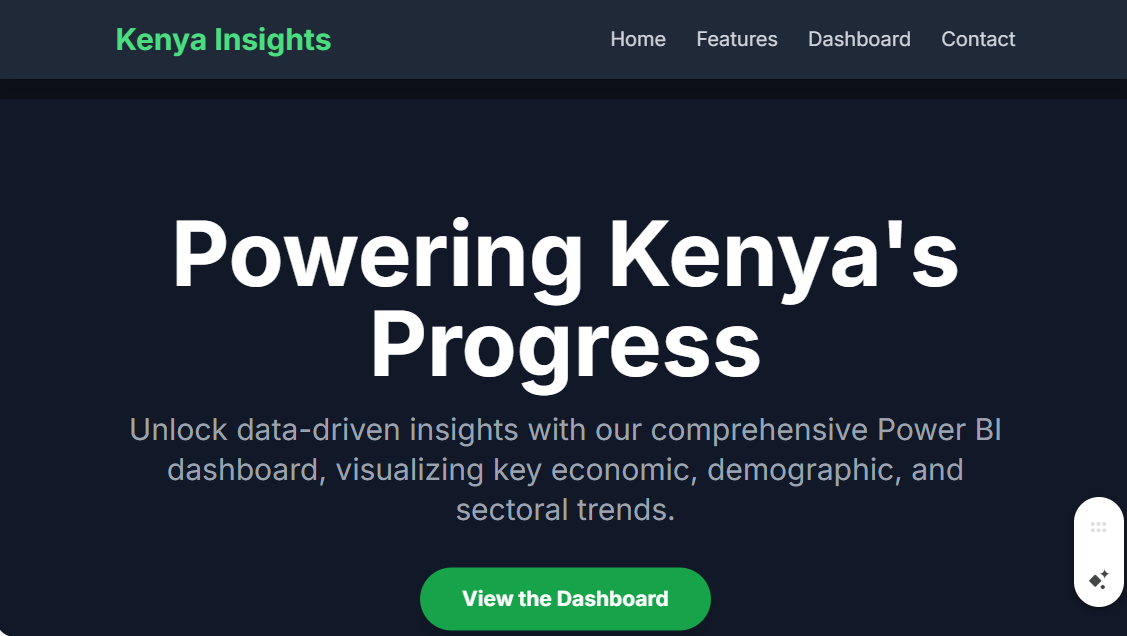
Unlock data-driven insights for Kenya with our Power BI dashboard. Visualize key economic indicators, demographic trends, and sectoral performance to inform strategic decisions.
In an increasingly data-centric world, the ability to collect, analyze, and visualize complex information is no longer a luxury but a necessity for sustainable growth and strategic planning. This is particularly true for a dynamic and rapidly developing nation like Kenya. Our Power BI Dashboard for Kenya serves as an indispensable tool, transforming vast datasets from various sources into actionable, easily digestible insights. This comprehensive platform empowers government agencies, private sector businesses, non-governmental organizations (NGOs), and researchers to understand, monitor, and predict trends across the country’s key sectors.
The core philosophy behind this dashboard is to demystify data. We recognize that data, in its raw form, can be overwhelming. By leveraging the powerful visualization capabilities of Microsoft Power BI, we provide an intuitive and interactive interface that allows users to explore a wealth of information without needing to be a data scientist. The dashboard is structured around several key themes, each represented by a dedicated report page, ensuring a holistic view of Kenya’s socio-economic landscape.
Economic Performance at a Glance
The economic indicators section is the centerpiece of the dashboard. It provides a real-time, or near real-time, pulse of the Kenyan economy. Users can monitor key metrics such as GDP growth rates (both national and by county), inflation rates (both headline and core), and foreign direct investment (FDI) inflows. The dashboard presents these figures through a variety of visualizations, including line charts to show trends over time, bar charts for comparative analysis, and geographical maps to visualize economic activity across Kenya’s 47 counties. For instance, a user could filter the data to see the GDP contribution of Nairobi versus Mombasa, or analyze the impact of agricultural policies on inflation in rural areas. The dashboard also includes visualizations on trade balances, showing imports and exports by product category and trading partner, providing critical intelligence for businesses involved in international commerce.
Demographics and Social Development
Understanding the population is fundamental to effective planning. The demographics report provides a detailed breakdown of Kenya’s population, drawing on data from sources like the Kenya National Bureau of Statistics (KNBS). This section features interactive visualizations on population distribution by age, gender, and county. Users can explore population density maps, which are crucial for urban planners, or analyze the dependency ratio to understand the social support needs of different regions. Education and health are also covered in this section. The dashboard tracks key social indicators such as literacy rates, school enrollment figures by level (primary, secondary, and tertiary), and health metrics like infant mortality rates and access to healthcare facilities. These visualizations are invaluable for NGOs and government ministries working on social development programs, allowing them to pinpoint areas of greatest need and measure the impact of their interventions.
Sectoral Deep Dives: Agriculture, Technology, and Infrastructure
Kenya’s economy is diversified, and the dashboard reflects this with dedicated pages for key sectors. The agriculture report is particularly detailed, as this sector remains the backbone of the economy for many Kenyans. It provides insights into crop production yields for staples like maize, coffee, and tea, and livestock figures. Users can visualize rainfall patterns against crop yields to understand climate impacts, or analyze commodity prices in local and international markets. This data is critical for farmers, agribusinesses, and policymakers alike.
The technology and innovation sector, often dubbed the “Silicon Savannah,” is another major focus. The dashboard tracks key metrics like mobile phone penetration rates, internet usage by region, and the number of tech startups and incubators. These insights are vital for investors looking to enter the Kenyan market and for policymakers aiming to foster a conducive environment for technological growth.
Infrastructure development is a key pillar of Kenya’s Vision 2030. The dashboard provides visualizations on the state of infrastructure, including road network coverage, electricity access rates by county, and key project updates. Interactive maps allow users to see the progress of major infrastructure projects, such as the Standard Gauge Railway (SGR) or new geothermal power plants. This information is crucial for construction companies, logistics firms, and government planning departments.
Interactive Features and User Experience
The Power BI Dashboard is designed for maximum usability. Its interactive features allow users to filter data by date range, county, sector, or a combination of these parameters. Drop-down menus, slicers, and dynamic charts enable users to drill down into specific data points, revealing underlying trends and anomalies. The dashboard also incorporates drill-through functionality, allowing a user to click on a high-level summary and be taken to a detailed report on that specific topic. For example, a user viewing a bar chart of school enrollment by county could click on “Turkana County” to see a separate, detailed report on education metrics for that specific region.
Data Sources and Reliability
The reliability and accuracy of the dashboard’s insights are underpinned by its robust data sources. The platform aggregates information from credible and authoritative organizations, including the Kenya National Bureau of Statistics (KNBS), the Central Bank of Kenya (CBK), the Ministry of Agriculture, the World Bank, and other international development organizations. Regular data updates ensure that the dashboard remains a relevant and timely source of information, providing users with the latest available figures to inform their decisions.
Conclusion
In summary, the Power BI Dashboard for Kenya is more than just a collection of charts and graphs; it is a powerful strategic tool. By transforming disparate data into a cohesive and interactive narrative, it empowers a diverse range of stakeholders to make informed, data-driven decisions that can drive economic growth, improve social welfare, and contribute to the sustainable development of the nation. It is a testament to the power of modern business intelligence to foster transparency, accountability, and progress in a developing economy.